App Store Visual Hierarchy: How Screenshot Order Affects Conversion
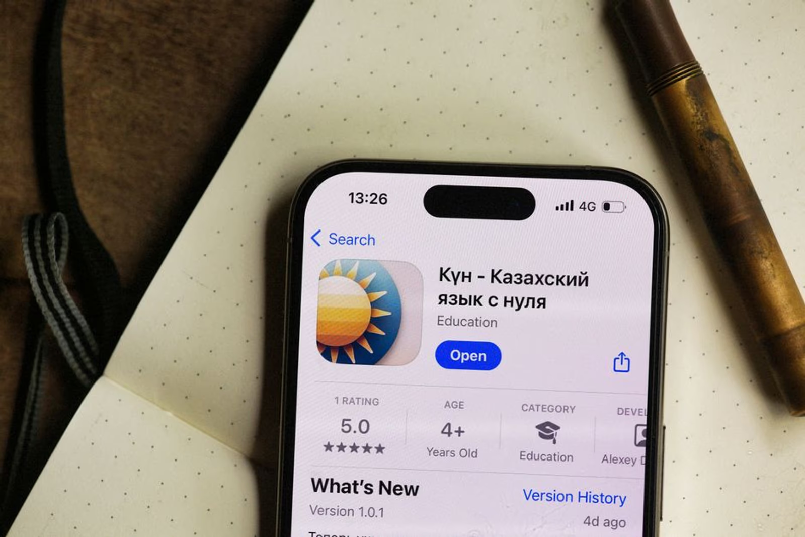
Most ASO conversations start with keywords. That's not wrong — keyword coverage drives impressions. But impressions don't install your app. The moment a user lands on your product page, screenshots take over, and the order you arrange them in determines whether they tap "Get" or scroll on.
This post breaks down how screenshot ordering affects app store conversion rate optimization, what patterns we see across categories, and what you should actually change if your conversion rate is underperforming.
Why Screenshot Position 1 Carries Disproportionate Weight
The App Store and Google Play both surface the first two or three screenshots in search results before a user even taps through to the full product page. On the App Store (iPhone), users see roughly 2.5 screenshots in the search card. On Google Play, the feature graphic and first screenshot dominate the initial impression.
This means your first screenshot isn't just a first impression — it's doing work before the user has decided whether you're worth a tap. If it fails, you've lost the install without the user ever seeing screenshots 2 through 10.
The psychological mechanism here is simple: users scan, they don't read. They're pattern-matching within seconds. A screenshot that leads with a feature UI without any caption or value framing asks the user to do interpretive work. Most won't bother.
Screenshot 1 should answer one question: what does this app do for me? Not what it looks like. Not what its UI components are. What it does.
Patterns Across 8 App Categories
We reviewed screenshot ordering conventions across apps in eight categories — productivity, fitness, finance, food delivery, healthcare, marketplace, social, and gaming — looking at top-10 apps by category rank on the App Store US store. What follows are patterns, not controlled experiments. Treat them as informed heuristics, not gospel.
| Category | Dominant Screenshot 1 Pattern | Screenshot 2–3 Typical Focus |
|---|---|---|
| Productivity | Outcome state (completed task, organized view) | Feature breakdown with captions |
| Fitness | Motivational stat or streak visualization | Activity tracking UI |
| Finance | Net worth / portfolio summary | Transaction list or budget breakdown |
| Food Delivery | Food photography + delivery time | Order flow / customization |
| Healthcare | Symptom or appointment entry | Doctor/provider profile |
| Marketplace | Search results or listing card | Booking / checkout flow |
| Social | Feed or discovery interface | Profile or connection feature |
| Gaming | Gameplay action shot | Character or world reveal |
A few things stand out immediately. Finance apps overwhelmingly lead with a number — a portfolio total, a savings figure, a credit score. That's intentional. The outcome is concrete, and the emotional hook is high. Compare that to some healthcare apps that lead with the UI for entering a symptom — which is process-focused, not outcome-focused, and typically converts worse.
Fitness apps that show a streak or a personal record in screenshot 1 outperform those that show a generic dashboard. The specific number ("Your 47-day streak") is more compelling than an empty-state UI.
The Caption Problem Most Apps Still Have
Walk through any mid-tier app's screenshot gallery and you'll find one of two failure modes:
No captions at all. The UI is just floating there, asking the user to figure out what they're looking at. This works when your UI is so immediately obvious that it sells itself — think a simple timer app. It doesn't work for anything with any complexity.
Captions that describe the feature instead of the benefit. "Track your workouts" is a feature description. "Never wonder if you're making progress" is a benefit. The second one creates tension and resolves it. The first one just restates what the screenshot already shows.
Captions in screenshots 1–3 are prime real estate. Short, bold, benefit-led. If your caption takes more than two seconds to read, it's too long. If it starts with a verb that describes UI behavior rather than user outcome, rewrite it.
How Position 4–10 Should Work
Most teams spend all their energy on screenshot 1 and then treat the rest of the gallery as a feature tour. That's a missed opportunity.
Screenshots 4 through 10 serve a different function: they convert the already-interested user. Someone who scrolls to screenshot 5 is leaning in. They want more detail, more proof, more specificity. This is where you can:
- Show social proof (ratings pull-quotes, user counts, press logos)
- Demonstrate a feature that differentiates you from the obvious competitor
- Address a common objection (e.g., "works offline" or "no credit card required")
- Show the onboarding flow if it's frictionless
The mistake is treating screenshots 4–10 as an extension of the feature tour that started at screenshot 1. They should shift from what this app is to why you should trust it and why now.
Semnexus runs full ASO audits — including screenshot hierarchy reviews, caption rewrites, and A/B test frameworks — as part of our mobile app marketing services. If your conversion rate isn't matching your impression volume, that's the right place to start.
Platform Differences That Actually Matter
Apple App Store and Google Play have different display conventions, and your screenshot strategy should account for both.
App Store specifics:
- Portrait screenshots on iPhone are displayed at approximately 392×696 logical points in search results, clipped at 2.5 screenshots
- The App Preview video (if present) autoplays muted in the search card on iOS — which means if you have a video, screenshot 1 matters less in search results but the video thumbnail matters enormously
- App Store Connect allows up to 10 screenshots per device class; most competitive apps use 6–8
Google Play specifics:
- The feature graphic (1024×500) appears above the screenshot rail and functions as a banner — this is separate from screenshots and often overlooked
- Play's search results show the feature graphic and first screenshot as a composite in some layouts
- Play allows landscape screenshots, which can work well for certain categories (games, productivity tools with dashboard views)
The practical implication: you can't just export the same screenshot set to both stores. At minimum, review whether your feature graphic on Play is carrying its weight, and whether your App Preview video on iOS is helping or hurting your search card performance.
A/B Testing Screenshot Order: What You Can and Can't Control
Apple's Product Page Optimization (PPO) lets you test up to three treatment variants against your default, with traffic splits you define. Google Play's Store Listing Experiments offers similar functionality. Both are worth using — but with clear eyes about their limitations.
What you can test directly:
- Screenshot order
- Caption copy
- Whether to lead with video or screenshots
- Color/design treatment of screenshots
What makes the results hard to interpret:
- Tests run across your entire audience, including users coming from different sources (search, browse, web referral). If your traffic mix changes during the test, the data shifts.
- Minimum test durations (typically 7–14 days minimum for statistical significance) mean slow-moving apps take a long time to get clean reads.
- You can only run one PPO experiment at a time on the App Store, so prioritize.
In our engagements, teams that have never run a PPO experiment typically see meaningful conversion rate movement when they test screenshot 1 against a better-framed alternative. "Meaningful" here means directional and consistent, not a specific lift percentage — every app's baseline and audience is different.
For more on how conversion signals connect to broader visibility, our post on deep linking and strategic marketing covers how traffic sources affect what users see and expect when they land on your product page.
FAQ
How many screenshots should I use on the App Store?
Use enough to make a complete case, but don't pad. In practice, 6–8 screenshots tend to perform well for complex apps. Simple utility apps can work with 4–5. Don't use 10 just because 10 is the limit — every screenshot that doesn't add information is a screenshot that dilutes the ones that do.
Does screenshot order actually affect my App Store ranking?
Screenshot order affects conversion rate, not keyword ranking directly. But conversion rate is a ranking signal — apps that convert better from impressions get rewarded in ranking algorithms over time. So yes, screenshots affect ranking, just indirectly through CVR.
Should my screenshots be portrait or landscape on iOS?
For most consumer apps, portrait (vertical) screenshots match the natural thumb-scroll behavior on iPhone and are the default expectation. Landscape works well for iPad-optimized apps, games, and some productivity tools. Don't mix orientations without a deliberate reason — it creates visual inconsistency in the gallery.
What should screenshot 1 always include?
At minimum: a clear visual representation of the core value (not a loading screen, not a login UI, not an empty state), and either a caption that states the primary benefit or a UI state that communicates it without words. The test: can a new user understand what they get from this app in under two seconds?
How often should I update my screenshots?
When you ship a meaningful new feature, when your conversion rate drops without a clear traffic-mix explanation, when a competitor significantly changes their visual positioning, or at minimum once a year to keep the design feeling current. Screenshots are not set-and-forget.
Can I use the same screenshots on both App Store and Google Play?
Technically yes. Strategically, you should adapt them. At minimum, use the Google Play feature graphic slot properly — that 1024×500 banner is prime real estate that many teams ignore entirely. If your conversion rate on Play is notably lower than on iOS for the same app, start there.
Screenshot order is one of the highest-leverage levers in app store screenshot optimization, and it's one of the few things you can change today without a code deploy. Start with screenshot 1. Get the benefit framing right. Then work forward through the gallery with a clear sense of what job each position is doing.
If you want a structured audit of your current screenshot hierarchy — including competitive benchmarking against category leaders — Semnexus's mobile app marketing team can turn that around as part of a full ASO engagement. Or book a 30-minute call with Marco and we'll tell you what we'd change first.